Backstory:
Everyone has a passion, or even a few passions. One of mine happens to be cyclocross. I
love to race cyclocross. It’s so much fun! Am I a speedy cyclocrosser? Nope. Do I maximize my fun while racing? Absolutely. Cyclocross is a quickly-growing sport among the cycling disciplines. Similar to other cycling styles, the women’s fields are smaller than the men’s but are growing! Every year, more and more women are trying out cyclocross and get hooked. Pretty quickly.
The numbers of women participants are still meager in comparison, due to a variety of reasons such as knowledge, skill and opportunity. Because of this, many grassroots communities have sprung up in parts near and far to address the need to grow the women’s cycling fields.
So began a community in the Pacific Northwest called WAWCX (Washington Women of Cyclocross). Originally, the community was established in late 2012 by a local pro to host a women’s only cyclocross festival. A bunch of the racers in the community came together to help plan the festival, and resource11 (me!) volunteered to take on the social media campaign. Because… love of design. Can’t escape that!
That campaign started with this logo.
This logo was leveraged on various marketing materials (Facebook posts, announcements, cycling kits, cycling hats, water flasks and even capes!
Fast forward a year, and WAWCX is a huge success. As planning began for the next year, the leadership at the Washington Women of Cyclocross continued with their focus on race and festival promotion. The leadership at Washington Women of Cyclocross rebranded their look, and is now Washington Women of ‘Cross, and are still going strong.
At the same time, I wanted to take the social media message of women and cyclocross to a wider audience: worldwide!
Enter…
CXsisters. A network of cyclocross lovers, seeking to grow the women’s cyclocross scene everywhere.
Challenge:
Create a cohesive look and feel for the CXsisters social media channels to attract more women into the cyclocross community worldwide.
Solution:
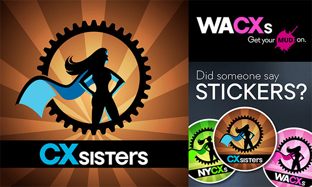
Design a logo based upon the original WAWCX look/feel, leveraging the graphical elements, and creating a recognizable icon among all local chapters.
First, the CXsisters logo —the uber brand—was developed with a purposeful use of color, a beefier font, and a blending of uppercase/lowercase letters. Considering this logo would be used at many sizes, keeping the chapter text succinct was key. Sub-brands of the CXsisters logo would use the same artwork, font, and graphical elements. The colors for different chapters vary, yet follow a monochromatic theme vs the more contrasted color theme of the head logo.
The text for each chapter region is a combination of the (US) state or region and the CXs of the CXsisters logo text. All text would be white except for the CX, which is a complimentary color of the logo background and other accent elements.
CXsisters logo design

WACXs logo design

NYCXs logo design

norcalCXs logo design

CXsisters chapter stickers
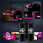
WAWCX marketing materials
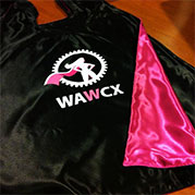
WAWCX cape design
No Comments
 This logo was leveraged on various marketing materials (Facebook posts, announcements, cycling kits, cycling hats, water flasks and even capes!
Fast forward a year, and WAWCX is a huge success. As planning began for the next year, the leadership at the Washington Women of Cyclocross continued with their focus on race and festival promotion. The leadership at Washington Women of Cyclocross rebranded their look, and is now Washington Women of ‘Cross, and are still going strong.
At the same time, I wanted to take the social media message of women and cyclocross to a wider audience: worldwide!
Enter… CXsisters. A network of cyclocross lovers, seeking to grow the women’s cyclocross scene everywhere.


Add comment